We tend to treat personal style as a commodity problem when it is often a perception problem. When we admire someone’s outfit or a beautifully styled room, we tend to think in terms of garments and items. A bag, a skirt, a couch, a paint color. We leave with a shopping list. If only I had that bag. Then we buy it and wonder why it falls flat. We still can’t achieve the same visual effect because we were looking at the wrong thing.
The art of seeing is one of the first and most important lessons taught by a good drawing or painting professor. Every art school freshman learns that the names we have for things get in the way of truly seeing them. In a drawing class, beginners don’t draw what they see, they tend to draw the symbol they carry in their heads. Once you learn to really look at an eye, for example, that symbol falls apart.
Style suffers from the same problem. We don’t see an outfit, we see the words we would use to describe it. Sweater. Loafers. Trench coat. The problem with nouns is that they compress enormous amounts of visual information into a single word. When we unpack them, we begin noticing things like visual weight, proportion, texture, and silhouette instead. Before we can get into the fashion, we have to talk about the words we use.
Designers talk about visual weight to describe how “heavy” something feels to the eye, regardless of its actual weight. A black silk scarf has far more visual weight than a white wool scarf, even though the white wool is physically heavier. If that feels abstract, don’t worry; we’ll look at it in practice in a moment.Proportion describes the relationship between the sizes and volumes of different parts of an outfit.Silhouette is the overall outline of an outfit — the first thing you perceive before noticing any individual garments.
These aren’t abstract design-school buzzwords. They’re the things you’re actually responding to when an outfit feels balanced, elegant, or awkward.
We respond to relationships, not objects. Shapes, contrast, textures, and proportions matter so much more than the names of the garments themselves. This is how we fail to replicate our style inspirations. We buy the sweater and the pants, but overlook the visual qualities that made the outfit compelling in the first place.
When people post aspirational style TikToks about Carolyn Bessette-Kennedy, for example, they often list her most-worn garments. Midi skirt, 3/4 sleeve tops, straight leg jeans. Those items are relatively incidental, though. It’s very easy to create looks using those exact garments that seriously miss the Carolyn Bessette-Kennedy mark. The internet is very good at identifying the nouns in Carolyn’s wardrobe and very bad at identifying the adjectives. We’re responding less to the garments themselves than to their restraint, simplicity, and proportion.
Carolyn Bessette-Kennedy has been a style icon for decades, but she’s experiencing another surge in popularity thanks to American Love Story, a TV show about her relationship with JFK Jr. I see so many “CBK-inspired” looks that Carolyn herself would not be caught dead in. I would love to share the looks that I think miss the mark here and break down why they don’t work for educational purposes, but I don’t want to be too shady. So let’s look at a couple classic Carolyn looks and figure out exactly why they work.
The most important thing to know about Carolyn is that she worked in fashion. She was absolutely aware of all the things I’m about to say. It wasn’t a coincidence that her outfits were so enviable. Her garments were all well-tailored, and she knew how to layer. More often than not, this is what we covet about her style. The minimalism works because each of her garments is perfectly calibrated to fit her proportions and to harmonize well with each other. The internet treats her style as a shopping list, but it was more like a system of proportions and carefully chosen garments.
The next most important thing is that Carolyn was 5’9” and thin. That is precisely why copying her garments is often less useful than understanding the visual effect they were creating. If your body type is like hers, then by all means buy her exact wardrobe. If I tried to wear clothes exactly like hers, they would not look the same on me. All of our bodies need to be styled slightly differently to achieve the same effect. Carolyn wears her clothes a bit oversized to give her figure a little extra dimension. A body like mine is best styled in true-to-size clothing that emphasizes my natural shape. Oversized fits like Carolyn’s swallow me and look ill-considered. Learning to recognize those differences on your own body is far more useful than memorizing someone else’s wardrobe. (Another essay on that later.) So, on to the photos.
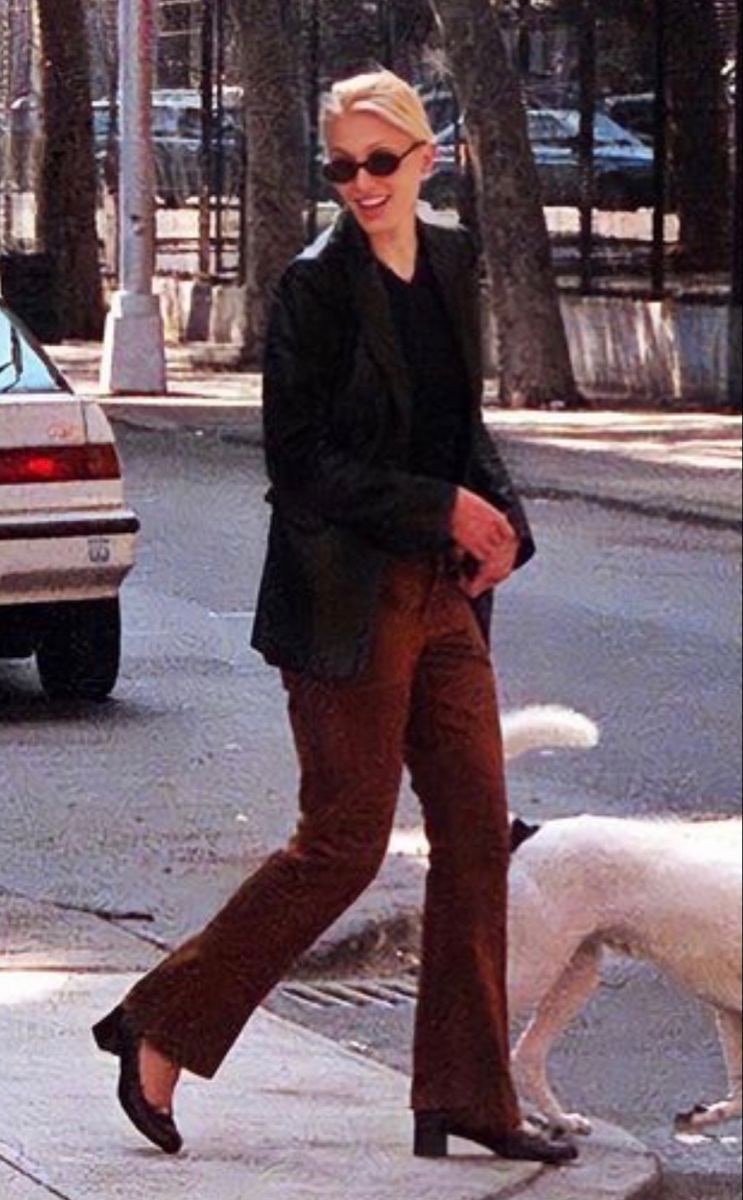
I won’t break down every aspect of this outfit, just the elements doing the most visual work. The first is proportion. The slight flare of her corduroys proportionally balances the oversized blazer, and the open jacket preserves a strong vertical line through the center of her figure. Notice how the eye continues downward from the inner hem of the blazer straight down the length of her leg rather than stopping abruptly at the blazer hem. This keeps the effect elongating rather than bulky, despite the volume of the jacket. The hem of these pants is also very important. They cover the ankle while allowing the toe to peek out the perfect amount. The combination of a flare and a low block heel is one of my personal favorites, because it allows the line of the pant to flow almost seamlessly down the foot and into the ground.
The second is visual weight. This is a visually heavier outfit than Carolyn typically wore, but it works because it is all in balance with her body and the other garments. The corduroy trousers, dark blazer, and blocky heels all carry substantial visual weight. None of them overwhelms the other. A delicate stiletto, for example, would feel oddly fragile beneath this silhouette. The block heel anchors the outfit.
The sunglasses are surprisingly important here, and probably the most difficult to conceptualize in this way. They’re much more delicate than the rest of the outfit, which is exactly why they work. Rather than adding another visually heavy object, they repeat the dark values of the blazer and shoes near her face, creating a visual connection between the upper and lower halves of the outfit without adding another heavy focal point. Their narrow oval shape also acts as a counterbalance to the blazer’s structured shoulders and sharp lapels. A large angular frame would reinforce the blazer’s geometry until it became overpowering; a perfectly round frame would feel too playful. These sit somewhere in between. They soften the outfit just enough to keep it from becoming severe, while remaining restrained enough that your attention stays on the silhouette rather than the accessory.
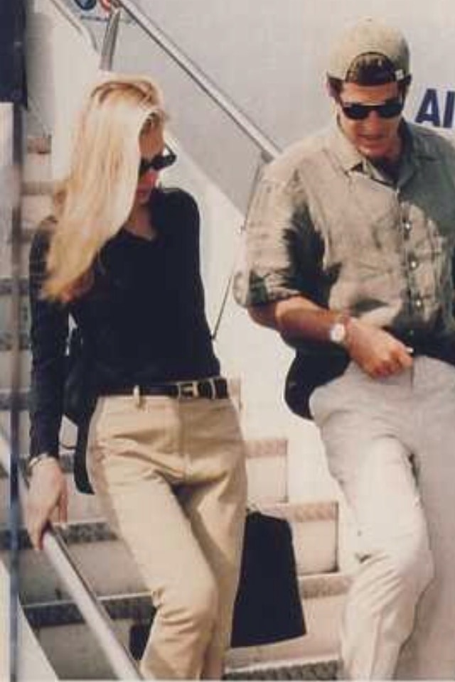
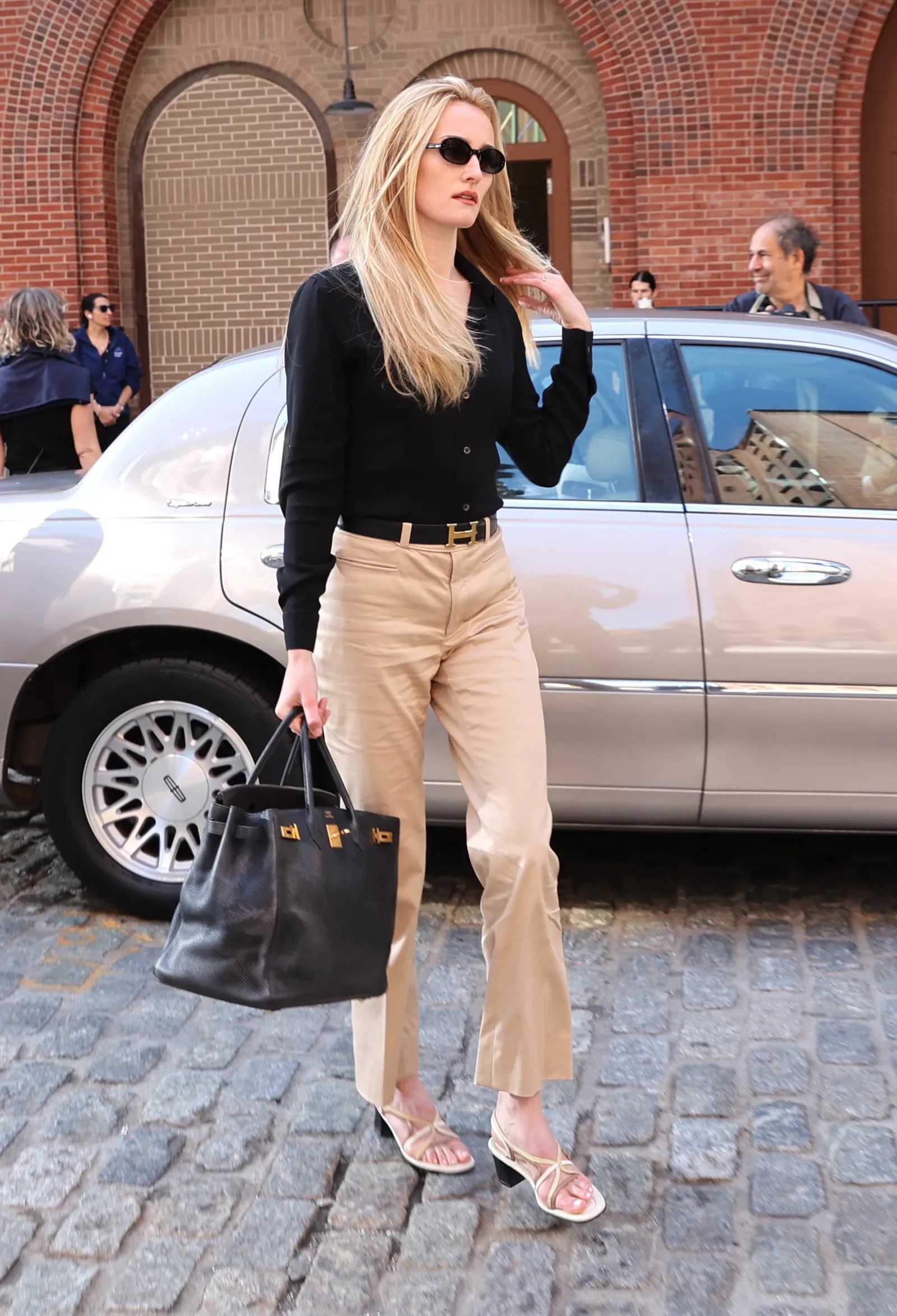
Let’s compare a real Carolyn Bessette outfit to its recreation in American Love Story. I said I wasn’t going to be shady, but I lied. I’d encourage you to stop here and take a good look at both of these photos. See what you notice.
For me, this recreation misses the mark so thoroughly, and even more so when we put it beside the original. Notice that almost none of these mistakes involve buying the wrong type of garment. They’re failures of proportion, texture, and visual weight; the exact things we’ve been talking about. Let’s work top to bottom.
The sweater bunches at the sleeves and isn’t slouchy enough in the torso. The buttons read like glossy plastic instead of horn or tortoiseshell. This looks like a cheap polyester sweater, not something Carolyn would’ve worn. Polyester wouldn’t be so offensive if the fit were right and the buttons looked convincing.
The biggest failure here is the waistline. Carolyn’s trousers sit relatively low on the hips. The slightly lower rise allows the sweater to skim the body rather than being tucked into a defined waist. That subtle shift changes the proportions completely. The American Love Story version has that belt cinched tightly at her waist, and it gives 2015 business casual instead of early-‘90s chic.
And my final gripe is the hem of the pants. We can’t see the hem in this particular CBK photo, but countless others make the point: Carolyn didn’t wear ankle-length trousers. Why can I see Sarah Pidgeon’s ankles?! Carolyn’s trousers would’ve been three inches longer and probably flared, allowing the line of the trouser to flow into the shoe instead of leaving an awkward space. Major oversight.
Here’s the thing: none of these choices are individually catastrophic. Together, though, they severely flatten what made Carolyn’s style so compelling. She wasn’t just wearing beige trousers and a black cardigan. She was wearing clothes that looked lived in, expensive without announcing themselves (except the Hermes belt), and indifferent to trends. That is much harder to replicate than it looks.
In reality, this is not about Carolyn Bessette-Kennedy. She helps make this point because she has become one of the internet’s favorite style references whose style is often misunderstood and poorly replicated. But the point is not to dress like CBK. It’s about learning to see well enough that you can understand any style you admire. Once you stop leaving with a shopping list and start leaving with a method, you no longer need someone else’s wardrobe to recreate what you loved about it.
Learning to draw didn’t just make me a better painter, it made me better at Seeing. It taught me to look at relationships instead of objects. That changed the way I look at paintings, outfits, furniture, architecture, even grocery stores. Objects are easy to sell. Relationships are not. Once you realize the beauty lives less in the object than in the relationships between objects, you stop shopping for magic and start learning how to see.